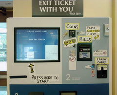
 Messaging plays a very important role in the design and function of kiosks and yet it is often considered at the last minute or overlooked entirely. You will frequently see kiosk deployments where the messaging has been reduced to graphics that have been applied wherever there was space; sometimes various disparate elements are added over time or simply plastered all over the units. This haphazard approach can do more harm than good as it creates a confusing post board effect for the potential user that conveys no clear messaging hierarchy; asking them in effect to look everywhere at once.
Many kiosk deployments rely on the potential user to make a snap decision as they walk by as to whether the service offered by the kiosk is useful to them. Consequently it is critically important that such messaging is carefully considered and organized to convey the correct information quickly and without confusion to the user at the right time. It’s no use if the user is informed of the fee structure for an Internet kiosk before he understands that the kiosk delivers Internet service!
Structure Your Messaging
The single most important factor in designing a messaging package for a kiosk is the visual hierarchy of the content.
By segmenting the messaging into a hierarchy that engages the potential user at varying distances you can instantly create a multi-tiered messaging system that attracts and informs the user at the appropriate time.
Often this can mean reducing the number of competing messages, organizing them so that they occur at the right height, correct distance and have the right size, contrast ratio, color or image choice to engage the correct potential user.
When properly implemented a cohesive messaging plan can be one of the most cost-effective ways to enhance the performance of your kiosk. Eye- catching and functional graphics can at once attract the attention of the potential user, inform them of the function and encourage them to interact with the kiosk.
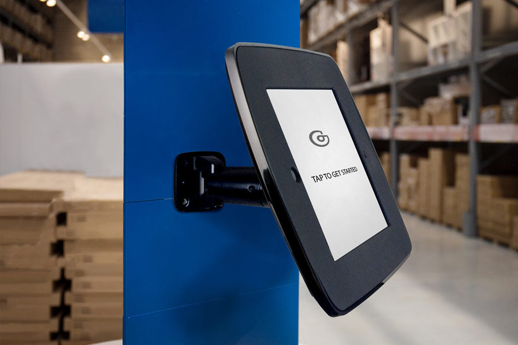
This messaging comes in the form of graphics applied directly to the machine, information displayed on the monitor, take-away brochures, marketing collateral, video attract loops on overhead or secondary monitors, audio loops, scrolling LED text etc. Throughout this article we will use a multi-function ATM as an example of how to directly apply these recommendations. These machines are good case studies because they embody all of the messaging challenges faced by a complex kiosk system including; branding, Primary, Secondary and Tertiary messaging, legal disclosures, changeable marketing offers and mandatory network disclosures.
Our example machine is an enhanced ATM that in addition to normal ATM functions offers bank-less check-cashing, money orders, wires transfers and pay-day advances.
Primary Messaging
The topmost message in this hierarchy should be the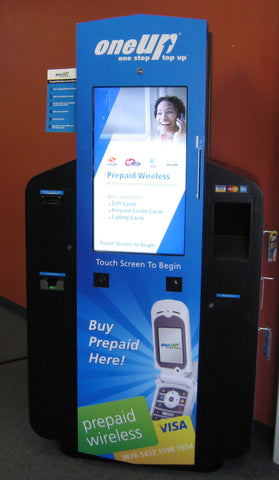 simplest and most engaging, most often the brand (if that’s important to the kiosk deployer) and/or the function of the kiosk.
These two messages can often be combined and can work well together, either as a branded descriptor such as the words “internet kiosk” in the form of a brand logo or as text associated with the company logo.
This element will be the item that engages the potential user at the longest distance (over 20’ away) and as such should be bold, large, clear and attention getting. The use of backlighting, dimensional graphics, motion and other attention getting display mechanisms is strongly recommended to add impact and attract attention. This messaging most often should be placed at the highest point possible on the kiosk and possibly designed to wrap around the unit or be seen from all directions.
If the brand has strong enough existing recognition the logo or branding element can often serve as the descriptor without any additional text (i.e. Kodak = photos). Indeed this should be the goal of all kiosk specific brands; to associate the function of the product with the branding in such a way that when the repeat user sees the logo or branding elements in the future they instantly fill in the descriptor in the their head (Kinko’s = copying). Over time users will begin to look for the branding elements and not the descriptor when searching for the service offered by the kiosk and this is right where a strong brand presence should be.
Using our financial services kiosk as an example Primary Messaging would be the bank logo or branding element with a descriptor such as “Financial Services” closely associated. Our 6' tall Backdrop Graphic is a great way to implement this on our range of iPad kiosks.
Secondary Messaging
The next tier is that of informing the user of the services offered by the kiosk. This list should be easy to read from a distance of 5’-15’ feet and be SIMPLE. This the second item to engage the potential user and it should clearly communicate to someone who is glancing at the machine as they walk past two or three key functions. If the kiosk has more than three functions they should be organized into groups or categories and those groups should be listed. It is very important not to overwhelm the potential user at this point as too much text, too many options, or too much description will only leave them confused and unclear on the purpose of the device and the services it offers. Lacking clearly perceived function most potential users will just keep walking. In this case the old adage “less is more” definitely applies.
This graphical element should be positioned high enough that it can be seen over or around someone who may already be using the kiosk (indeed when you are at the kiosk using it you this text should be out of your field of vision) and it should ideally be located such that the eye naturally flows from the brand element/ primary messaging to this element.
In the case of a multi- function machine this grouping and hierarchy of services can be a difficult task. The kiosk deployer’s marketing and business units will need to be engaged in a discussion with the designer in order to determine how to rank and group these services. The designer should take into account that this graphical element may need to be changed over time as the business and marketing needs of the kiosk deployer changes or as periodical special offers are marketed.
In the case of our financial services kiosk it’s Secondary Messaging might read “check-cashing & pay-day advance, bill pay, money order & wire transfers” This is a good example of where grouping like services together (or those services likely to considered by the same customer) can reduce the amount of visual processing a potential user has to do.
Tertiary Messaging
This is the final level of messaging that helps to encourage a user to interact or begin a transaction with the kiosk. It is designed to function at a distance of five feet or less; most often being placed at eye height or within the field of vision of the lower 5th percentile female and upper 5th percentile male.
Tertiary Messaging is most typically pricing information, instructions on how to initiate a transaction (touch the screen to start, swipe card to begin) or promotional information (50% off on your first transaction!). This level of messaging can be on the primary interface display or printed graphics applied to the machine. It should not compete for attention with the Primary or Secondary messaging, often being more subdued, smaller in size and/ or maintaining sufficient physical distance to visually separate it. In the example of our financial services kiosk this messaging might be “2% check-cashing, 1$ money-orders, swipe card to begin”. Our digitally printed faceplate graphic is a great way to accomplish this on our iPad kiosk range.
Interface Messaging is information that informs the user while they are engaged in the interaction process. It includes labels and graphics applied directly to the unit adjacent to components the user will interact with (such as card swipes, bar- code readers, receipt printers etc) and often has a Braille component. This text (or graphical sign) should be high contrast and simple (one or two words). Printed labels can be augmented with LEDs that light up relevant to the user interaction to working in effect as a visual prompt. If the components are grouped around an interactive display this messaging may take the form of context sensitive directions that pop-up at the correct time in the user-interaction flow. Such contextual information becomes critically important when the user is engaged in a complex, multi-step interaction (insert card, scan check, enter personal information, take print-out). In the case of our financial services machine this might be instructions in braille to pickup the phone for help and printed graphics with embedded LED’s labeling the discreet components.
Ancillary Messaging
This is a catchall category that can include many different graphical elements such as; seasonal marketing offers, brochures and pre-printed takeaways, legal disclosure notices, ATM network bugs, Credit Card network bugs and other items. Often a kiosk will need to post locale-specific legal disclosures whose content, size and location is determined by the authority with legislative oversight. In such instances they may have rules in place for offering such services in a non- kiosk environment that do not directly translate to a kiosk deployment. Consequently some discussion will have to be had for placement on or near the kiosk. Credit Card and ATM network bugs are fairly strictly mandated by the individual networks as far as size, color, arrangement and location.
Seasonal marketing offers, brochures and other pre-printed takeaways are most often the initiative of the deploying organization’s marketing unit and will be controlled by them as business conditions determine. Flexibility of deployment is the key here as they may be refilled, changed or updated by any number of different company representatives including; field service technicians, drop-shipping direct to site-manager, field sales force or other. The designer should place them in close proximity to the main interface area and design the enclosure to afford easy replacement or updating without keys or other security measures. In the case of our sample financial services kiosk the legal disclosure may be placed on the side of the machine or adjacent to it on a wall, the Credit Card and ATM bugs will be placed conspicuously as they are a major element in communicating services to a potential user, a brochure holder will placed adjacent to the main interface area although at such a distance that a potential user would be comfortable taking one without interfering with the privacy of an active user.
Conclusion
We have found that the graphic messaging hierarchy outlined above is a useful tool when discussing projects with clients. It highlights the importance of a well-designed graphics package in the success of a kiosk program and stimulates key internal stakeholders (especially marketing and sales) to think about how the potential user will view their product. It can also be used to prioritize or streamline the functions of a kiosk that is suffering from “Swiss army knife syndrome.” It has become a key point when setting goals for our design briefs; we hope that you find it useful.
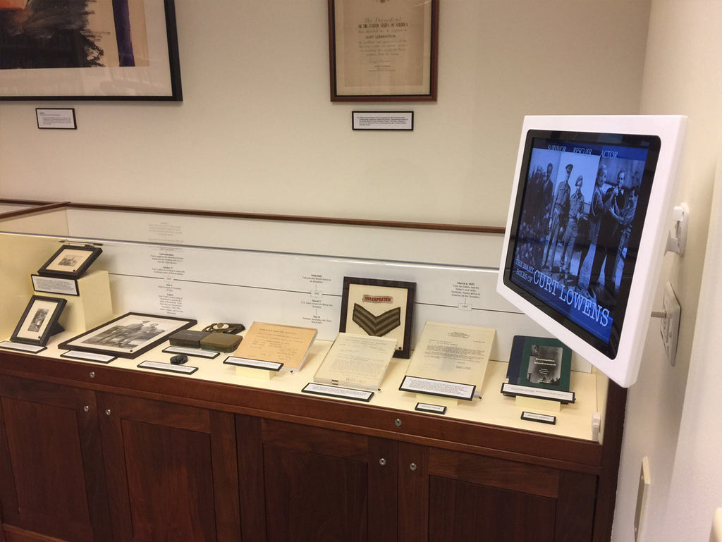
Thanks to Craig Keefner for the first photo in this article.